After reading the excellent – Algorithms to Live By: The Computer Science of Human Decisions last year, I was pleased to see Brian Christian (@brianchristian) not only has a new book out but also he was presenting a virtual event at Ri.
The presentation explored the ethical issues of Artificial Intelligence and what happens when it goes wrong, and is based on his new book The alignment problem: how can machines learn human values?
The presentation can be seen on the Ri YouTube channel
The journey starts in 1939 with – Bertrand Russel, Walter Pitts and Warren McCulloch. Citing examples such as machine learning issues in the judicial system and racial bias, the discussion moved onto the two key challenges
The training data
The objective function
Examples where issues with training data caused undesirable consequences included offensive misclassification of photo and even a self driving car collision resulting in the death of a pedestrian.
Examples of issues with objective function issues included ethical issues and how models can learn in unexpected ways to “game” the system to get what are unexpected outcomes.
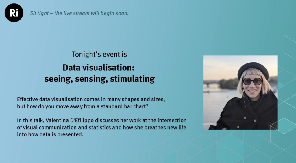
I attended a fantastic Royal Institution event today – Data visualisation: seeing, sensing, stimulating from Valentina D’Efilippo – @defilippovale
It started with a historical context and problem solving in the 1800’s. John Snow mapped the outbreak of cholera in Soho and noticed the proximity of high infection rates to certain street water pumps. Concentrations around Broad Street (todays Broadwick Street) were observed as a source of the disease which was confirmed when the pump handle was removed. Also note worthy were the lack of cases at the nearby brewery proving the health benefits of beer? A great early use of data science and visualisation.
Giving more modern examples, a plethora of Covid 19 data visualisation charts were shown and the importance of these in telling the story of what is happening. The “flatten the curve” charts have been a really good visualisation and story telling vehicle with great impactful on policy and the public response.
Overall the importance of both hearts and minds was emphasised by the emphasis on both the Science and Art. The science comprising of data and statistics. The art more concerned with graphic design and visual story telling.
A few other noteworthy things to follow up in my notes:
William Playfair – The inventor of modern pie charts / graphing / charting
Global warming colour spectrum – a colour plot telling the compelling story of climate change
Data Design Principles
Data – as creative material
Design – as a tool to aid understanding
3 steps to an impactful visualisation:
See – make data visible
Sense – the implications should be clear
Stimulate – the data should drive action
The presenter has produce a book: Infographic History of the World – book by the author
She gave three examples
Example 1
Which was the most significant war – 133 wars 95 M deaths She used inspiration from science, art, nature Looking at Poppy and its significance – using flower size, stem length and height to represent the data
What would music look like through data visualisation?
Using David Bowie for inspiration and his song Space Oddity which in turn was influenced by the film 2001 a Space Odessy and by the 1960’s Apollo Moon missions. Some of the techniques used included:
Zoom into the grooves!
Major Tom and Ground Control characters represented and their distance apart
Visual form to the music itself
Overall the data was the vehicle to explain human experiences.
Example 3
Social Media force for change – MeToomentum.com from the impactful movement from the Alyssa Milano tweet @Alyssa_Milano
The visualisation used the Dandelion metaphor with the following attirbutes
With the recent rush of people joining alternative messaging services, following the WhatsApp privacy policy update, I thought I’d take a look at how the signal protocol works. Luckily I didn’t need to look far as the good folks at Computerfile have already created some excellent explanatory videos.
It provides the answers to the questions:
How does end to end encryption work even when the message recipient isn’t online?
What does it mean when I get “your safety number has changed” from a trusted contact?
How do group chats preserve security?
A great video came up in my YouTube feed today. A video from the excellent Computerphile channel caught my eye. It concerned turning pictures of sound waves back into audio files. It was entitled How NOT to Sample Audio!
The basic method used was as follows:
Get a screen grab of a sound file waveform (in the time domain)
Loop through the columns of the BMP picture file to find and extract the approximation of the waveform
Brightness is used to detect if the difference between background and the sound
A loop is used to pick out column max and min heights
Store these values as the sound (basically a series of values
To compensate for low resolution, a stretch is required to make up for fact the resolution of the image is less in columns than you would have samples, in an audio file
Values added between samples to enable the stretch
Add the WAV file header information to the series of numbers you have created
In the example in the film, an 8 Bit sound generated in a 35k file (ASCII). Clearly the WAV to graphics accuracy is dependant on the number of screen pixels used.
The result reminded me of the first voice synthesis I heard from the Commodore 64 game, Ghostbusters! The magic of hearing “you slimed me” is etched in my mind,
Reading the comments on the video I also noticed someone had mentioned a fascinating project called the Visual Microphone. A quick search of the internet revealed the following paper and website. The Visual Microphone: Passive Recovery of Sound from Video
Possibly the oddest conference presentation ever. People from around the globe presenting papers remotely to an IEEE conference in China just after midnight on New Years Eve to New Years Day. The conference had to be postponed due to the pandemic and the new timing meant my presentation had to be at a session starting at the very dawn of the new year, remote, and also that recordings had to be provided in case the tech failed (recording below). I’m not sure how many of the delegates and presenters were sober but it made for a memorable, if not strange experience. Sorry but I had to miss Jools Holland this time!
Paper ID: IEEE TrustCom 2020
Title: Enhancing Cyber Security Using Audio Techniques: A Public Key Infrastucture for Sound
Conference: The 19th IEEE International Conference on Trust, Security and Privacy in Computing and Communications (IEEE TrustCom 2020), Guangzhou, China, December 29, 2020 – January 1, 2021